Short Video Custom Code
This section focuses on embedding short videos and configuring custom behaviors using the available properties.
Properties
1. video-id (Required)
- Description: The unique identifier for the video you want to embed.
- Type:
String - Example:
video-id="ec1632ca-97be-4fec-b167-e34512abb21a"
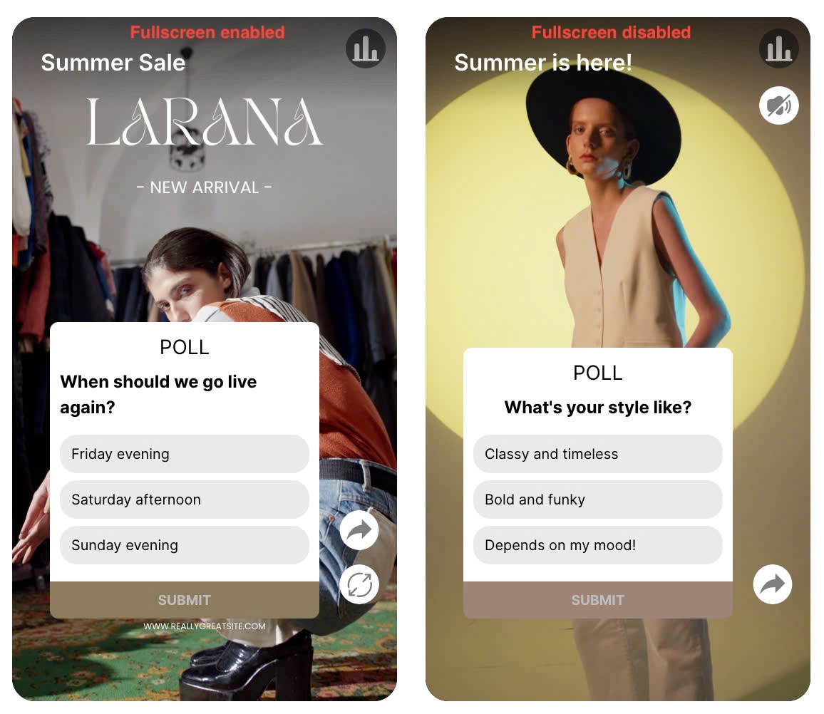
2. enable-fullscreen (Optional)
- Description: Controls whether the fullscreen mode is displayed on the video player.
- Type: Boolean
- Default: true
enable-fullscreen="false"
Example
Disabling Fullscreen: To disable the fullscreen functionality on the embedded video player, you can use the enable-fullscreen property. Setting this property to false will hide the fullscreen button, preventing users from entering fullscreen mode.
Embedded Video Example
<video-embed class="lora-embedded-video loaded"
   video-id="ec1632ca-97be-4fec-b167-e34512abb21a" enable-fullscreen="false">
</video-embed>
Playlist Example: Story Block
<story-block-playlist
   playlist-id="00dcfcd5-41f1-405b-c748-08dbb98a1f8b"
   video-height="480" enable-fullscreen="false"
>
</story-block-playlist>
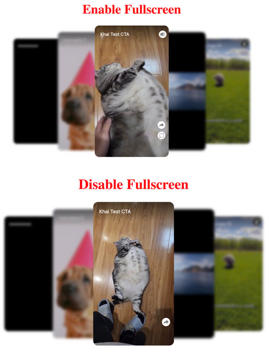
Playlist Examples: Carousel and Grid
The UI for carousel and grid playlists does not change when enable-fullscreen is set to false; however, users are prevented from accessing fullscreen mode by clicking the video.
<grid-playlist
   playlist-id="00dcfcd5-41f1-405b-c748-08dbb98a1f8b"
   video-height="480" enable-fullscreen="false"
>
</grid-playlist>

<carousel-playlist
   playlist-id="00dcfcd5-41f1-405b-c748-08dbb98a1f8b"
   video-height="480" enable-fullscreen="false"
>
</carousel-playlist>
3. pip-style (Optional)
- Description: Defines the style of the Picture-in-Picture (PIP) container on the screen. This attribute accepts a semicolon-separated list of CSS styles. Supported keys include
top,left,bottom,rightand any valid CSS properties. If thetoporleftvalues are provided, the correspondingbottomorrightdefaults will not be applied. - Type:
String - Default:
bottom:0px; right:15px;
The pip-style property enables full customization of the PIP container's style. You can specify position, size, color, or any other CSS properties. If not set, it defaults to the bottom-right corner.
Examples
<!-- SINGLE VIDEO -->
<video-embed class="lora-embedded-video loaded"
   video-id="ec1632ca-97be-4fec-b167-e34512abb21a" pip-style="top:50px; left:30px;">
</video-embed>

<!-- CAROUSEL -->
<carousel-playlist
   playlist-id="00dcfcd5-41f1-405b-c748-08dbb98a1f8b"
   pip-style="top:50px; left:30px;"
></carousel-playlist>

<!-- GRID -->
<grid-playlist
   playlist-id="00dcfcd5-41f1-405b-c748-08dbb98a1f8b"
   pip-style="top:50px; left:30px;"
></grid-playlist>

<!-- STORY BLOCK -->
<story-block-playlist
   playlist-id="00dcfcd5-41f1-405b-c748-08dbb98a1f8b"
   pip-style="top:150px; left:90px;"
></story-block-playlist>
4. min-h-btns (Optional)
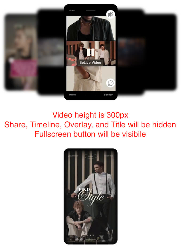
🚀 Overview
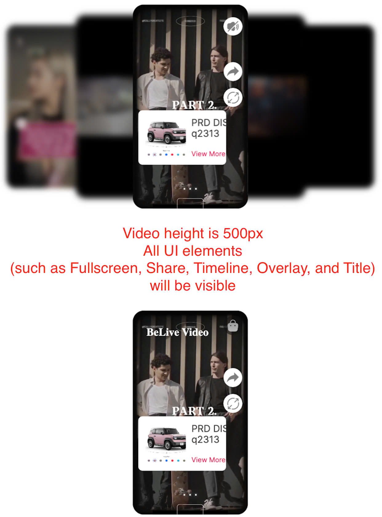
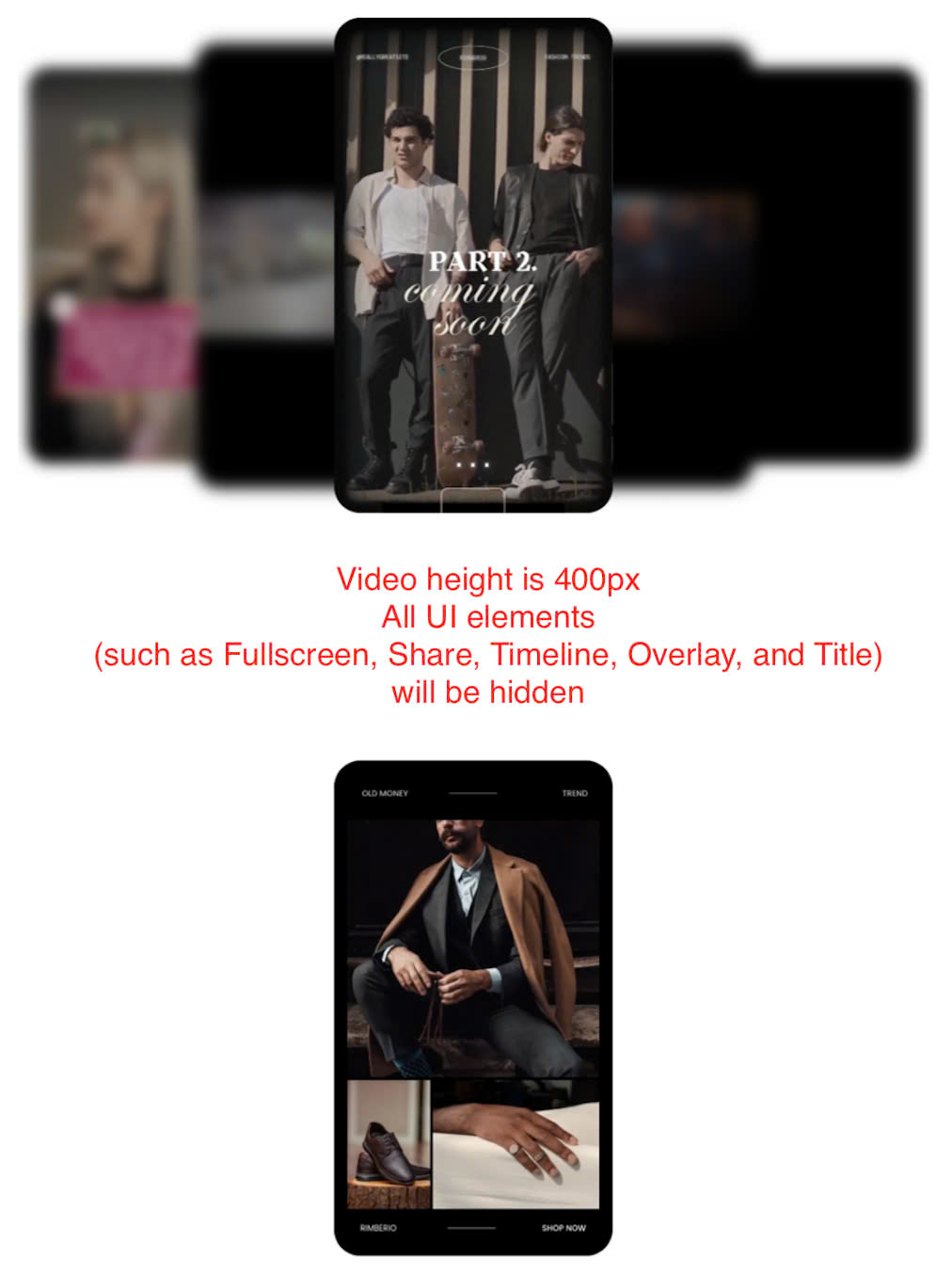
The min-h-btns attribute controls the minimum video height required to display various UI elements in the short video component, such as Fullscreen, Share, Timeline, Overlay, and Title.
It supports:
- A single value (number): Applies the same height threshold for all elements.
- An object: Allows setting different thresholds for each UI element.
🔹 Basic Usage
<story-block-playlist
    playlist-id="ab516b7b-f152-4b28-ca45-08dd4b23727d"
    loop
    min-h-btns="480"
></story-block-playlist>

<video-embed
    video-id="dfc0fc5d-1b1a-4de3-9fa0-78220b5b9124"
    min-h-btns="480"
></video-embed>
✅ **All UI elements (such as Fullscreen, Share, Timeline, Overlay, and Title) ** will be visible when video-height >= 480px.
🔹 Using Separate Values for Each Button
<story-block-playlist
    playlist-id="ab516b7b-f152-4b28-ca45-08dd4b23727d"
    min-h-btns='{"fullscreen": 256, "share": 468, "timeline": 320, "overlay": 350, "title": 400}'
>
</story-block-playlist>

<video-embed
    video-id="dfc0fc5d-1b1a-4de3-9fa0-78220b5b9124"
    min-h-btns='{"fullscreen": 256, "share": 468, "timeline": 320, "overlay": 350, "title": 400}'
>
</video-embed>
✅ Fullscreen button appears when video-height >= 256px.
✅ Share button appears when video-height >= 468px.
✅ Timeline appears when video-height >= 320px.
✅ Overlay appears when video-height >= 350px.
✅ Title appears when video-height >= 400px.
⚙️ Props
| Attribute | Type | Default | Description |
|---|---|---|---|
min-h-btns | number or object | 256 | Sets the minimum height required for showing the Fullscreen, Share, Timeline, Overlay, and Title. If a number is provided, it applies to all. If an object is used, different values can be set for each part. |
🎯 Behavior
| Scenario | Effect |
|---|---|
min-h-btns="256" | All elements appear when video-height >= 256px. |
min-h-btns='{"fullscreen": 256, "share": 468, "timeline": 320, "overlay": 350, "title": 400}' | Each element appears at its defined threshold. |
min-h-btns not set | Default value { fullscreen: 256, share: 256, timeline: 256, overlay: 256, title: 256 } is applied. |
⚠️ Notes & Best Practices
- Ensure
min-h-btnsis correctly formatted:- ✅
min-h-btns="256"✅ (Applies to all elements) - ✅
min-h-btns='{"fullscreen": 256, "share": 468, "timeline": 320, "overlay": 350, "title": 400}'✅ (Separate values) - ❌
min-h-btns='{fullscreen: 256, share: 468, timeline: 320, overlay: 350, title: 400}'❌ (Invalid JSON format)
- ✅
- This attribute only controls visibility, it does not modify element behavior.
- If
video-heightchanges dynamically, elements automatically adjust visibility.
🏁 Conclusion
- The
min-h-btnsattribute provides flexibility in controlling visibility of various UI elements. - You can use a single value for all elements or separate values.
- Proper JSON formatting is required when using object syntax.
🚀 Now you're ready to configure UI element visibility based on video height in your Web Component!